Hi everyone! In this tutorial, I’ll be going through some general tips when using layer image masking and a couple of more fun and advanced tricks to use in our paintings, animations, or finishing effects.
I hope that helps!

A quick introduction to layer image masking
Layer image masking is a really powerful tool for working non-destructively because you can re-edit the image masking without losing the pixels they hide.
First, let’s quickly review how they work:
When we create a layer mask, it appears as a thumbnail next to the layer.
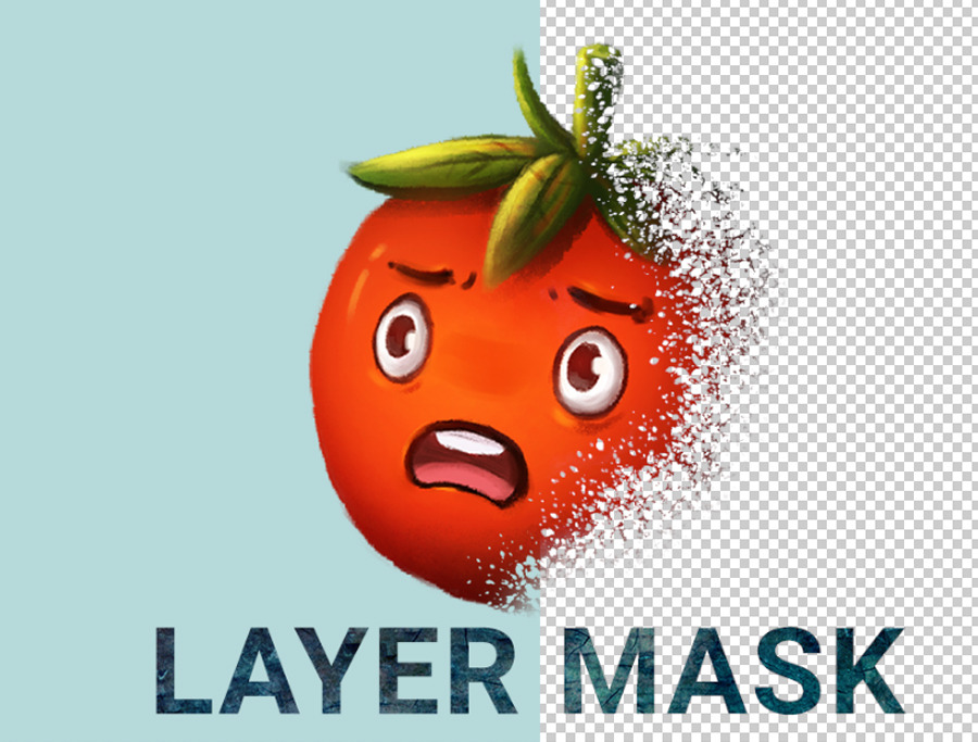
■ The concept of image masking is quite simple, the mask is a grayscale image, the black parts hide the original pixels while the white reveals.
▼ [1] Here I prepared a simple example illustration to review the basic operations of the mask. I have a tomato drawing on a separate layer. we are going to apply a layer mask to this layer.

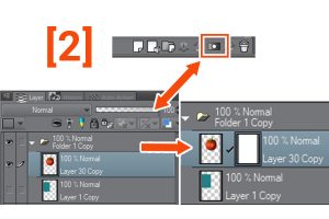
[2] Create a layer mask.
To do this, we can click on the icon to create a layer mask in the [Layer] palette, or go to the [Layer] menu → [Layer mask] → [Mask outer selection] (as indicated in the manual If a selection is not created, the mask is applied to the entire layer).
TIP: Alt-clicking on the layer mask icon will create a black mask, so the entire layer will be hidden. This is useful when we want to hide all image data and display the parts we need.
[3] Now that we have created the layer mask we can use the Eraser tool (shortcut E) or use any brush and paint with transparency (shortcut C).
IMPORTANT: First, make sure the layer mask is selected, click on the layer mask thumbnail (a black border appears around the selected layer for editing).
■ When we paint with transparency, we hide the layer, but the original pixels remain intact.
To reveal hidden pixels just paint with any opaque color.
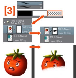
Note that we can use any brush tool to paint with transparency on the layer mask, as well as the fill tools, so experiment with decorative brushes to achieve various effects.
▼ [4] An example of the masking process. Please note that we do not lose any information about the original layer which we only hide and reveal. (Non-destructive workflow)
NOTE: We can use layer image masking on all layer types, not just Raster.
This is especially useful when working with tone and fill layers, as well as images and patterns and correction layers, as we can maintain the editability of these types of layers.
If you want to learn more about layer types, read this tutorial.
To make working with image masking easier, let’s list the basic operations we can do with layer image masking and also some terminology that I will continue to use throughout the tutorial.
■ I will show you examples of practical use of these functions later when working on some more advanced skins. Hope that makes sense.
Some basic operations:
- Delete: select [Layer] menu> [Layer Mask]> [Delete Mask] to delete the layer mask of the selected layer, or click and drag the layer mask to the trash can icon in the [Layer] palette.
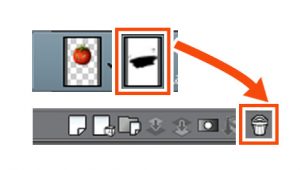
Apply Mask to Layer: [Layer] menu> [Layer Mask]> [Apply Mask to Layer] to combine the layer and layer mask, this subtracts the mask from the original pixels.
■ NOTE: When we mask the layer, it becomes a Raster layer, regardless of the original type.
- Move: we can move the mask from one layer to another by clicking and dragging the mask on the [Layer] palette.
- Copy: we can copy a mask from one layer to another using ALT + Click and drag the layer mask thumbnail in the [Layer] palette.

Invert: if we press CTRL + I, the hidden and revealed areas will change.
- Activate / Deactivate mask: SHIFT + Click the layer mask in the [Layer] palette or in the [Layer] menu> [Layer mask]> [Activate mask]

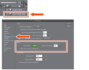
Show / Hide mask area: we can show the masked area by ALT + Click the layer mask in the [Layer] palette or [Layer] menu> [Layer mask]> [Show mask area]
■ NOTE: To change the way the mask is displayed, go to the [File] menu> [Preferences]> [Layer / Frame]
In the Mask tab, it is possible to change the color and opacity. I changed it to a 100 opacity bright green to make it easier to see the mask area when editing.
LINK / UNLINK: to link or unlink the mask to the layer, we can click between the thumbnails or go to the menu [Layer]> [Layer mask]> [Link mask to layer].
■ NOTE: When linked, a checkmark will appear between the layer thumbnail and the mask in the [Layer] palette

IMPORTANT: when unlinking we can move and transform the layer and layer mask independently, this is really useful, I’ll use it in more practical examples later.
▼ In this example, I unlinked the layer and image masking and then selected the original layer, not the mask, to move or transform (CTRL + t) within the mask.
Note: We can use tonal correction in the layer mask by going to the [Edit]> [Tonal Correction] menu, for example, Tone Curve or Levels, to change the mask data. We can also use filters like Blur.
Understanding Clipping image masking
A clipping mask is a quick way to mask a layer to existing layer pixels.
■ Note: For example, we can use clip image masking to add shadows to the hair on a separate layer, apply a texture, or color the lines.
Let’s test how they work:
▼ [1] In this example, I have prepared separate layers, one for the lines, one for the solid color, and a couple of layers for clipping.

[2] I created another layer on top of the Lines layer and then I painted some random colors with a large soft brush. When we cut the layer below it will only show in the opaque pixels of the layer below, in this case, the lines.
▼ [3] Allows you to cut the color layer to the lines, to do so we select the layer above and click the [Clip to the layer below] button in the [Layer] palette.
As you can see, the color is only showing in the lines.
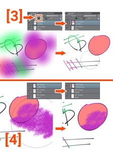


[4] I repeated the same steps for the solid color inside the circle but using a textured brush.
As you can see, clipping image masking is a good way to add details on previously painted areas without making a mask.
■ Note: we can stack multiple clipping image masking on the same layer. and we can also cut groups.
Also, we can combine the clipping mask with a regular layer mask to further refine the image.
Creative use: mask images in editable text
Let’s combine some of the basics we just learned to apply an image to editable text.
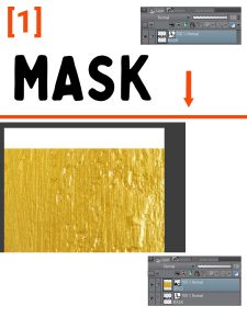
▼ [1] here I prepared a simple editable text layer and image texture. using mask we don’t need to rasterize the image to keep the original data.
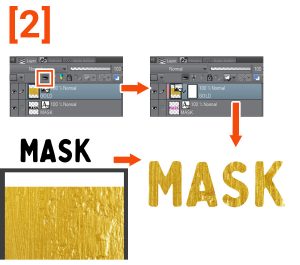
[2] Next, let’s clip the Image (Gold) layer to the editable text layer. First, we select the image layer and then press the [Clip to the layer below] button in the [Layer] palette, this applies the gold texture to the text.
[3] Now we are going to further edit the image texture by combining the clipping mask with a normal layer mask. We are going to create a layer mask on the texture layer and paint with a brush to hide some parts and reveal the text layer below.
■ Note: To show the benefits of using editable layers, I changed the color of the text layer to magenta. This can be changed at any time without losing quality.
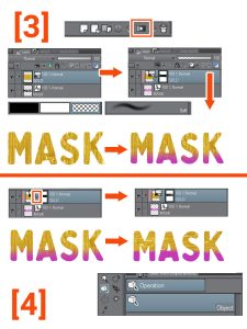
[4] Now I edited the golden texture. To do it first, I unlinked the layer mask by clicking the checkmark between the thumbnails.
Then I selected the Object Tool (Shortcut O) to move and scale the image within the layer mask.
■ Note: We can keep making changes to skins or images, this is the power of non-destructive workflow, so don’t be afraid to experiment.
▼ Unbound golden texture edit:
final result:
Masking and clipping differences: blending modes
When we work with clipping and masking we notice that they behave in a very similar way, but there is one key difference when we use blending modes.
■ Note: I will use blending modes in the practical examples, but will not delve into how they work because it is beyond the scope of this tutorial. If you want to learn more about them, read this tutorial. ▼

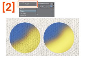
▼ [1] To explain the differences, I prepared two copies of a blue circle with a yellow layer on top.
In one of the circles, the yellow layer is cut out, while in the other the yellow has a mask.
To obtain the masking, we create a selection based on the circle, to do this we can CTRL + click on the layer thumbnail or go to the menu [Layer]> [Layer selection]. Then we create a mask with this selection loaded.
■ Note: if we remove the link to this layer mask, it will work the same as the cut one.
[2] Now we are going to configure the blue circles with the multiply blending modes. Here we can see the differences, when we work with a clipping mask, the yellow layer in the upper part follows the transparency that the blending mode carries, while with masking we preserve all the yellow information.
[3] Layers and image masking folder: we can use a folder to organize our work, but we can also use them for effects and production. They allow us to stack different layer image masking to make more complex image masking and maintain the ability to edit all of them.
■ For example, we can group a couple of layers for correction, texture, and so on. then apply a layer mask to the whole group to highlight only the parts we need. or use a layer mask on the group to define the boundaries we need instead of duplicating the layer image masking from one layer to another.
To create a folder of layers, we can click on the icon in the [Layer] palette or, more conveniently, we can select the layers we want and then go to the menu [Layer]> [Create a folder and insert layer] to create a folder and insert the selected layers inside.
■ TIP: I assigned the CTRL + G shortcut to [Create a folder and insert layer] so I can select the layers I want to group and then use the shortcut.
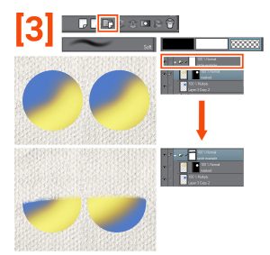
Just treat the skin in the folder the same way as any skin.
Here I have drawn explicitly and with a text with a text ▼
Quick mask and selection layers
Picks are an essential tool for working on digital art. There are several ways to create them, like the Lasso tool, the Marquee tool, or the [Automatic Selection] tool.
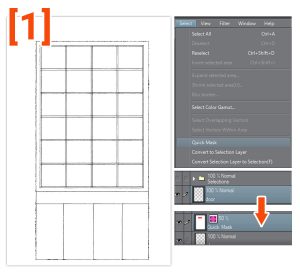
An easy and powerful way to create selections is through the quick mask mode.
▼ [1] To use the quick mask, just go to the [Select]> [Quick Mask] menu, it will create a [Quick Mask] in the [Layer] palette (by default it appears as 50% opacity Red for reference)
[2] Now we can start filling this layer with any fill or paint tool. I used the filling tool with the option to refer to other layers. When we paint with opaque color, it is filled with the default red, and we can erase it by painting with transparency
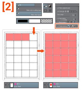
[3] When we finish filling in the areas we want to select, we return to the [Select]> [Quick Mask] menu. This will remove the quick mask layer and turn the filled areas into a selection.

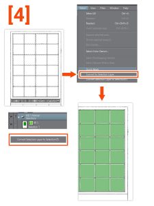
SELECTION LAYERS: Now that we have a selection, we can create a Selection layer to save and reuse later.
▼ [4] We are going to create a selection layer. With a selection active, let’s go to [Select> Convert to Selection Layer]. This creates a green layer by default, don’t worry, this is for reference only.
■ NOTE: we can go to [Select> Convert Selection Layer to Selection] or CTRL + click on the thumbnail to load the selection. It is also a good idea to keep all layers of selections within a folder for organization.
Creative use: mask layers and editable fill patterns
■ In the example above, we created a Selection layer. Now we are going to use this selection to mask editable fills to experiment with color.
▼ [1] First, we load the selection. [Select> Convert Selection Layer To Selection].
With this selection active, we go to the menu [Layer]> [New layer]> [FILL]. This creates a fill layer with a mask that reflects the selection.
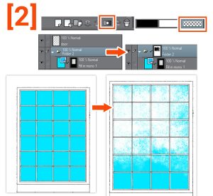
Note: By selecting the Fill layer with the Object tool (shortcut O) we can quickly edit the colors by changing the color sliders or within the [Tool Property] palette. This allows us to experiment with color in a more casual and simple way.
I put the fill layer under the door lines and also inside a folder for stacking image masking. [Layer] menu> [Create a folder and insert layer]
■ Let’s add some texture by applying a mask to the Layer folder, this will not affect the mask on the fill layer, so we can work without fear of making mistakes or losing data.
▼ [2] First, add a Mask to the Layers Folder, and with a Textured Brush and a transparency color, we paint some texture on the fill layer (we are hiding pixels).
Now let’s experiment with colors. By using the Object tool and moving the color sliders.
Let’s keep experimenting with the basics of skins.
▼ [3] Now I added an image as a texture. To reuse the fill layer mask, I duplicate it with ALT + click and drag.
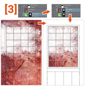
[4] Then I unlink the mask and apply a transformation to the image (CTRL + T). ▼
Another example: this time we are going to work with patterns.
▼ [5] Let’s first create a pattern from an image. Here I have a couple of characters.
To create a pattern, go to the menu [File]> [Import]> [Image Pattern]
This opens the [Open] dialog box and we can select the image that we want to make the pattern for.
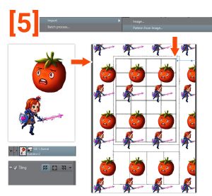
[6] Next, we reuse the mask from the fill layer and edit the pattern with the object tool or the [Tool Property] palette.
■NOTE: This is a simple example, please try patterns to get different results.

Images as image masking: gloss to opacity
Let’s explore a way to turn images into image masking by making the brightness of a layer transparent.
■ NOTE: This can be useful, for example, to make specific changes to the shadows in an image or to apply a weathered texture to a layer.
▼ [1] Here I prepared an example with an image layer (keep out) and a texture layer to get the mask selection.
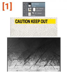
[2] Then we change the glossy pixels of the texture layer to transparent by going to the menu [Edit]> [Convert brightness to opacity].
This function makes the white of the image transparent and keeps the dark areas.
■ NOTE: when we apply this function, the opacity varies between Black 100% opaque and White 0% opacity
■ Now we can load the result as a selection by pressing Ctrl + click on the layer thumbnail or using the menu [Layer]> [Selection ]> Create Selection
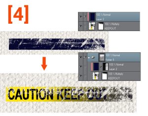
[3] With the selection loaded, we can hide the texture layer and create a mask on the image layer (keep out). This will mask the image with the texture. Then we unlink the mask to find the part we want by moving the mask.
■ Note: I need more contrast to achieve the distress effect I want, so I will edit the layer mask by going to the [Edit] menu> [Tonal Correction]> [Level Correction] and adjusting the contrast with the sliders.
[4] Here, as a quick example, I added another layer of details by clipping a layer of blue with a mask and placing the two layers inside a folder.
Then I added the background watercolor paper texture to the folder mask following the same process as before
I will now show a technique that we can use when finishing an illustration or to gain more in-depth control of effects.
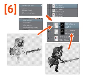
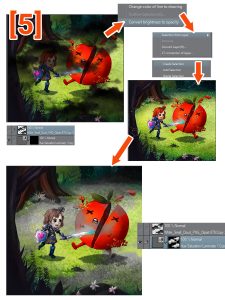
▼ [5] Here I have a flat image of a character. I’ll use [Convert Brightness to Opacity] to separate the Shadows and highlights and create image masking for each. This will give us great control of the finishing process.
■ NOTE: we can use image masking to add tonal corrections, textures, etc., to the shadows and lights independent of each other.
First, I create two duplicates of the original layer, one for the shadows and the other for the reflections.
Then go to the menu [Edit]> [Convert brightness to opacity].

■ IMPORTANT: To create the selection of the highlights, I will invert the layer by pressing Ctrl + I before applying [Convert brightness to opacity].
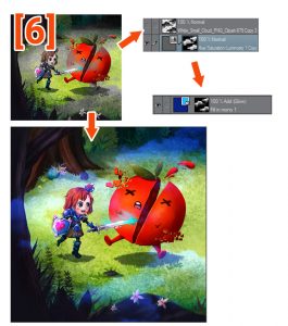
[6] We can now load layers as options. We create two layers, one for each, and apply a layer mask. I called on the layers to help me stay organized.
■ NOTE: Once created, we can edit the image masking if we need more contrast in the same way as before. To show which areas are masked, Alt + click the mask thumbnail.
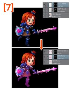
[7] with the image masking created we can explore all the finishing touches we need. Always working non-destructively and combining all the basic techniques.
In this example, I added some glow by changing the LIGHTS layer to add the blending mode (glow) and added some color to the shadows.
■ NOTE: As I keep repeating, this is just a simple example of the functionality, apply the concepts to your work, and don’t be afraid to try different combinations.
Select and mask objects in your photo
I will show you a way to select and mask Objects from a photograph using an old television.
▼ [1] First, we duplicate the original photo and change the [Expression Color] to Gray from the [Layer Property] palette. To avoid misalignment between the mask and the original layer, avoid moving or scaling the layers.
■ NOTE: Our goal is to create areas with high contrast and clean edges to select the parts of the image that we do not need. in this case, I will change the background to pure black and the TV screen to white.
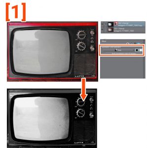
[2] I added a level correction layer to edit the contrast, making most of the background black and keeping the edge of the TV fairly clean. To create it, go to the [Layer] menu> [New Correction Layer]> [Level Correction].
Then I create a merged copy of the visible layers by going to the menu [Layer]> [Merge visible to new layer]

[3] Using a combination of picks and fill tools like the lasso and the Brush tool, I painted the flattened layer to get clean edges and pure colors whenever possible. This is necessary to achieve a good selection with the [Automatic Selection] tool.
■ NOTE: An easy way to refine areas of gray alongside black or white without losing the edges is to use the brush tool with an overlay blending mode. Then we paint with opaque white or black and it will only focus on areas other than 100 pure.
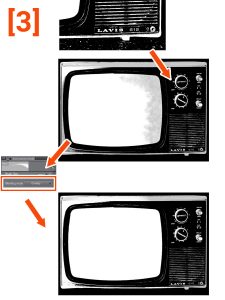
▼ [4] Now that we have light edges and areas, we can create a layer mask on the original layer. Using the [Automatic Selection] tool allows us to select the areas we want to mask and complete the layer mask.
■ NOTE: When we are happy with the results, we can apply the layer mask by going to the menu [Layer]> [Layer mask]> [Apply mask to layer].
Now we have the isolated television to use in any project we want. (We can also save it as png for transparency)

Creative effect: Textured shadow
We are going to create a simple effect using the basics of layer image masking.
▼ [4] Here I have an illustration of a tomato with a shadow on the grass.
First, create a layer and set it to be duplicated with reduced light. Then create a layer mask on the shadow layer and paint with a greenery or texture brush to blend the shadow’s edges to the ground.
■ NOTE: This is a simple effect, but using the basics we can get great results and edit them if necessary.

Creative effect: editable character glow
We’re going to keep combining techniques with more practical examples:
This time we’re going to create a Glow effect behind a character for a cool, magical look that always works non-destructively.
▼ [1] Here we have the character, a girl with a sword. We want to apply a finishing effect to the illustration to make it stand out or, for example, to make promotional art for the game.
The first step will be to load the original layer as a selection to make a mask.
Ctrl + Click on the layer thumbnail or use the menu [Layer]> [Layer Selection]> Create Selection
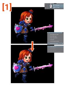
[2] With the selection active, we create a fill layer below the original layer by going to the menu [Layer]> [New Layer]> [Fill]. And then we unlink the mask.
■ NOTE: Remember that we can change the color of the fill layer with the Object tool or from the [Tool Property] palette.

[3] Let’s apply a filter to the mask. in this case, I will use a motion blur filter to create the glow behind the character.
■ First, we must select the mask layer by clicking on the thumbnail. > Then we go to the menu [Filter]> [Blur]> [Motion blur]. This opens a dialog to modify the filter settings.
We play with the settings until we achieve the desired effect and press OK to apply the blur to the mask.
Then we activate the original layer above and the basic Glow effect is ready.
■ Note: We can still change the fill color to test different results.
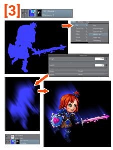
[4] We can continue to experiment by mixing the basic techniques we have learned so far.
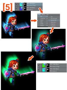
In this example, I duplicate the fill layer and change the color. Then I set the layer blending mode to Add (glow) This results in an Effect with more glow and color change.

[5] To further edit the result in this example, I added a Gaussian blur to the Top Fill Layer Mask menu, Filter]> [Blur]> [Gaussian Blur].
> After that I changed the color of the top layer to green using color slides with the selected Object tool.
The result is a smoother glow blur.
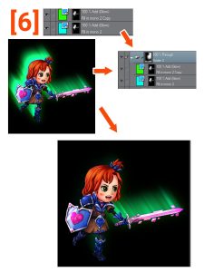
▼ [6] We can try to mask the effect so that it appears glowing only from the Sword.
To do this, we place the fill layers inside a Folder, to stack the image masking. Then paint with a soft brush to hide unwanted pixels.
■ Note: We can continue to combine basic techniques and filters and get all the results we can imagine.
The final result ▼

Creative use: corrections of layers and image masking
Correction layers are really useful for finishing artwork because they can modify the color and contrast of all the layers below them, we can modify their settings, and we can also use clipping and layer image masking with them by adding another customization layer to the process of finish.
■ Note: We are going to explore some of the uses for correction layers, as well as experiment mixing the techniques we have learned earlier.
▼ [1] The basic use of correction layers is to polish the final image, such as using a tone curve layer to add contrast or a vignette effect.
First, we create a tone layer, from the menu [Layer]> [New correction layer]> [Tone curve]
and we play with the settings to add contrast to the image.
■ Note: when we create a tone layer, a dialog box opens with the settings for the type of correction we select. Here we modify the settings and press OK when done. If we need to edit the correction layer, we can double-click on the layer thumbnail to open the settings.

▼ [2] The new repair layer has a built-in layer mask. We can use this mask to hide the effect in the same way that we use image masking on other types of layers.
■ TIP: If we want to modify only a part of the image, a good practice is to play with the effect settings to achieve the result we need, then fill the mask with transparency to hide the whole effect.
After that, we can paint with opaque color to show the effect only on the parts we want.
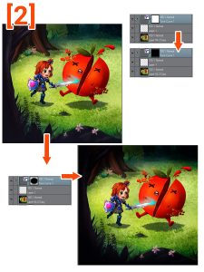
▲ here we achieve a vignette effect by revealing the tone layer only at the edges of the image.
▼ [3] We repeat the steps but with a Hue / Saturation / Luminosity layer, we use this layer to adjust the colors of the image. Here I desaturate the image and then apply it to the tomato.

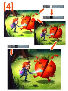
▼ [4] to add brightness to the characters I created another tone curve layer and then developed it just over the characters.
■ NOTE: We can use blending modes with correction layers to achieve different results, as well as the opacity of the layer. in this example, I set the tone curve layer to Add (Glow) and lowered the opacity to make the effect less obvious.
Sometimes it is better to exaggerate the effect before masking, to help us paint over the areas we want, then we edit the Correction layer to get the correct result.
▼ [5] Let’s experiment with using image textures to mask correction layers, to see what kind of results we can get.
I placed a cloud-like texture, then the [Edit] menu> [Convert brightness to opacity]> Ctrl + click thumbnail to load the dark parts as a selection.
Then I use this selection to mask a Hue / Saturation / Lightness layer.
▼ [6] Here I duplicated (ALT + Click and drag) the mask from the Correction layer to a fill layer set to Add (glow) to get a color cloud glow effect.
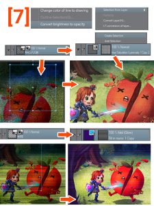
▼ [7] Let’s try other types of texture.
First, we apply a canvas or a weathered pixel texture to the tone layer. The result is textured desaturation. It gives an old effect.
The other is textured horizontal lines, I apply it to a fill layer set to Add (Glow) and the result looks like an old screen with some interference.
■ NOTE: Experiment with other textures and combinations.
Creative use: glitch effect
Let’s use a combination of filters and image masking to achieve a distorted or flawed look. This effect looks complicated at first, but it’s just a stack of layers with different basic techniques applied.
▼ [1] To start, let’s try a moderately distorted and distressed effect.
First, we need to duplicate the Base artwork layer. We then used the Fisheye filter to transform the layer and distort it. The [Filter]> [Distort]> [Fisheye Lens] menu will open the dialog with the settings. After that, we can paint in an opaque color to show the effect only on the parts we want.
Finally, we copy the distorted horizontal line image masking from the last example and adjust the contrast using the menu [Edit]> [Tonal correction]> [Level correction].

Here is the result ▼

▼ [2] Let’s try the effect of a more extreme glitch. This time we use the Wave filter to get the distortion we want. Menu [Filter]> [Invert]> [Wave] and then paint the mask to show only the parts we want.
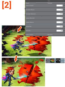
▼ [3] We can stack a couple of layers for a more refined look. In this example, I repeated the Glitch layer and set it to Add (glow). With the mask unlinked, we can move the effect until we like how it looks.
> Then I created a layer set in Color blending mode and filled it with Cyan.
This layer is clipped to the duplicated glitter layer to get a Glitch Glow color.
■ NOTE: I have added other layers of texture color correction.
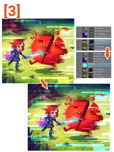
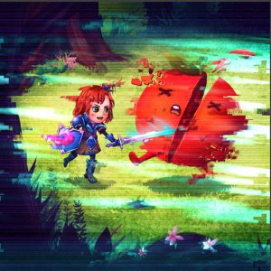
▼ [4] Finally, for a more organic look, I selected the Glitch glow mask and applied a motion blur filter. [Filter] menu> [Blur]> [Motion blur].
I played with the settings until I liked the final result.

Here is the final effect ▼
Creative use: heatwave | Glass effect
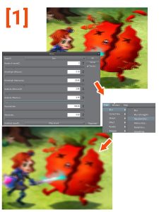
Following steps similar to the previous example, we will create a heatwave or a distorted glass effect.
▼ [1] To duplicate the base layer we apply the wave filter. [Filter] menu> [Distort]> [Wave]
This time we played around with the settings until we got a smooth, curved wave.
Then we apply a menu [Filter]> [Blur]> [Gaussian Blur] to achieve the effect we are looking for,
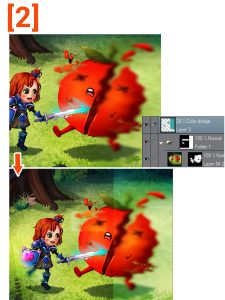
▼ [2] to create a glass effect I created a layer folder to add a mask, and then I created a Color Dodge layer to touch the glass.
Quick final result ▼

Animated effects: keyframes and image masking
Have fun animating skins to create finishing effects. I’ll quickly go through a couple of effects.
Explaining the animation features of Clip Studio is beyond the scope of this tutorial, so if you’re unfamiliar with animation, read this tutorial. ▼
▼ [1] The basics of animation image masking are keyframe activation.
First, we create a layer folder to group the layers we want to mask and paint the mask. Then we untie the mask.
In the animation timeline, we press the button to activate keyframes on the layer.
In this example, I added boxes at the position of the mask. for the beginning and the end
Clip Studio generates the interpolation between keyframes and creates the animation for us.
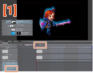
▼ [2] Here I show the first and last frame and how the position of the mask changes.
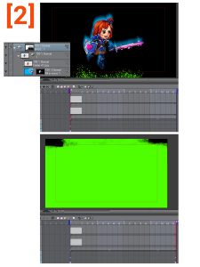
Now let’s see it animated ▼
The mask reveals the character. but if we press CTRL + I on the layer mask, we invert the masked areas. Creating a disintegration effect. ▼
After similar steps, I created this glow mask animation for a tone curve layer ▼
If we modify the scale instead of the position, we can create a pulsating glow. ▼
Now using all the masking techniques we learn that I created a more complex animation ▼
Final thoughts
Well, this is the end of the tutorial. Hope it wasn’t too complex.
I tried to be thorough with the explanations of all the functions and techniques, so maybe I talked too much, sorry.
I didn’t have time to go into detail on the animation part, maybe for another tutorial.
Layer image masking is confusing at first, but by following the basic operations, we can achieve excellent results. I hope you can use some of my tips in your work and remember to experiment and combine techniques.
The most important thing is to be creative. Please don’t be afraid to try new things.
See you next time. Thanks for watching.

