I noticed that teespring.com uses a mask that is set up in a certain way to act as skin within your web application. This is what the image looks like when I open it in Photoshop:
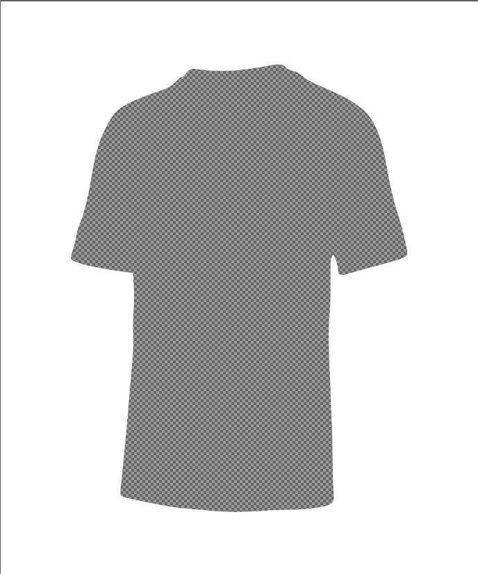
But, this is how it looks in your web application:

How is this masking effect achieved in photoshop?
Here is the real picture for reference:
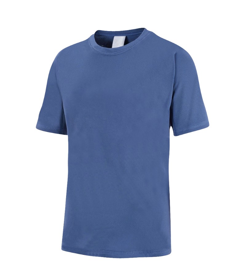
How to do it in Photoshop without using any flashy tricks:
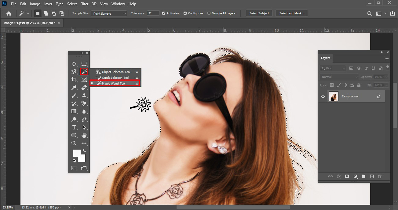
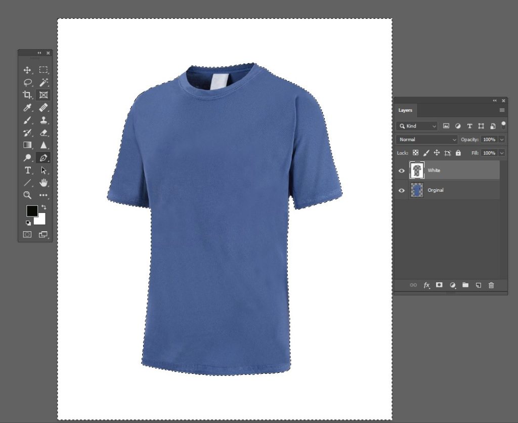
Start with a photo of a white shirt. Remove the background using a clipping path or another method that leaves a perfect solid edge. The magic wand and color-based selection methods are generally useless for this purpose when the target is a photo:

The bottomless shirt is a cape called Original.
Add a new empty layer “White”. Make a selection on the Original layer. Using the magic wand, select the void around the shirt and paint on a layer of solid white “White” filled with the selection. Use a large, solid brush. Do not use the paint bucket.
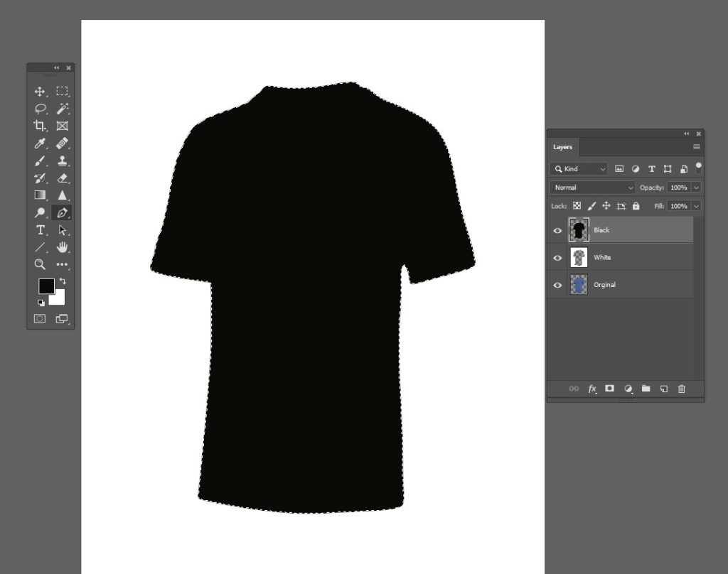
Insert a new empty “Black” layer. Invert the selection (reselect the void, if necessary, don’t try to select the shirt) and paint the selection’s solid black full on the “Black” layer:
Go to the original layer, select all and copy the content of the layer to the clipboard.
Go to the black layer and insert a layer mask.
Move to layer mask (= click mask icon holding Alt at the same time). Paste the original shirt from the clipboard in place (= Ctrl + Shift + V) to the mask.
Invert the layer mask (Image> Adjustments> Invert). Now you should have on screen:
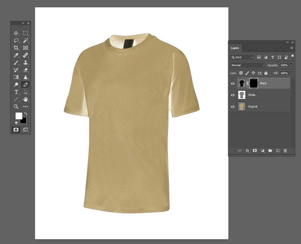
That is the layer mask. If you click the content icon for the layer and close the Original layer, you will see the desired result:
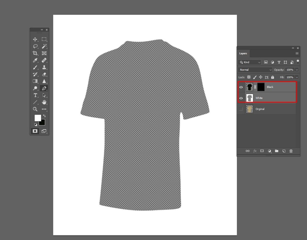
Now you can delete the Original layer, combine black and white layers, and export the image as PNG.
If you place it over any image with blending mode = Normal, the image is displayed in the hole and shaded:
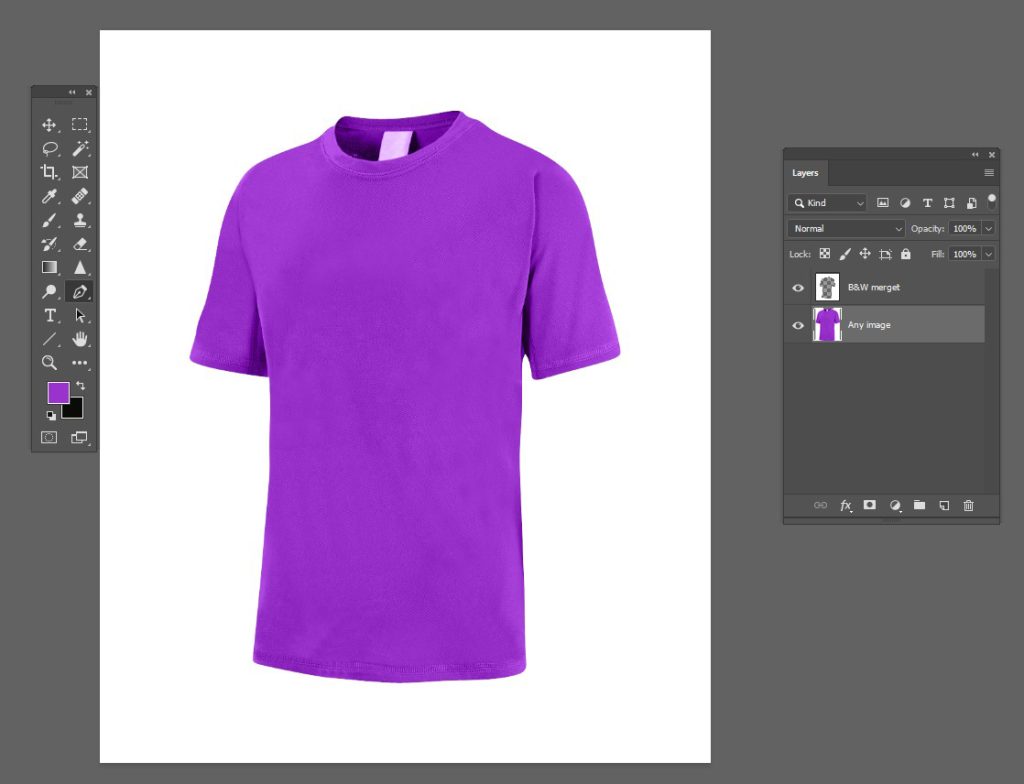
NOTE: It is also useful to save the multilayer image version. You can apply curves to the layer mask of the Black layer to find the appropriate shading intensity.
The next step towards more realism would be to use the original image of the shirt as a displacement map for the “Any Image” inserted. That would make the wrinkles more plausible. But that is beyond the scope of this answer.
You can see exactly how it’s done by looking at it. The “White Area” outside of the shirt is white (100% opacity), the area of the shirt is transparent (to show the design underneath), and there are some shadows that overlap to give it the feel of a material.
To apply the mask on the web, they have layered the PNG over their artwork using SVG. There is almost definitely another step in their particular process as the mask they have in that png just doesn’t seem to shade properly if it is only applied as a mask.
However, it can certainly work with solid background color as an outer mask and basic shading (and highlights) within the masked area.


